code pen : Partage de code css
Source sur codepen : 100 days css Button N° 045
Code HTML
<!doctype html>
<html>
<head>
<meta charset="utf-8">
<title>Document sans nom</title>
</head>

<body>
	<div class="container">
    <div class="center">
      <button class="btn">
        <svg width="180px" height="60px" viewBox="0 0 180 60" class="border">
          <polyline points="179,1 179,59 1,59 1,1 179,1" class="bg-line" />
          <polyline points="179,1 179,59 1,59 1,1 179,1" class="hl-line" />
        </svg>
        <span>HOVER ME</span>
      </button>
    </div>
  </div>
</body>
</html>
code CSS
@import url('https://fonts.googleapis.com/css?family=Lato:100&display=swap');

body, html {
  width: 100%;
  height: 100%;
  margin: 0;
  padding: 0;
  background: #5CA4EA;
  overflow: hidden;
  font-family: 'Lato', sans-serif;
}

.container {
  width: 400px;
  height: 400px;
  position: absolute;
  left: 50%;
  top: 50%;
  transform: translate(-50%, -50%);
  display: flex;
  justify-content: center;
  align-items: center;
}

.center {
  width: 180px;
  height: 60px;
  position: absolute;
}

.btn {
  width: 180px;
  height: 60px;
  cursor: pointer;
  background: transparent;
  border: 1px solid #91C9FF;
  outline: none;
  transition: 1s ease-in-out;
}

svg {
  position: absolute;
  left: 0;
  top: 0;
  fill: none;
  stroke: #fff;
  stroke-dasharray: 150 480;
  stroke-dashoffset: 150;
  transition: 1s ease-in-out;
}

.btn:hover {
  transition: 1s ease-in-out;
  background: #4F95DA;
}

.btn:hover svg {
  stroke-dashoffset: -480;
}

.btn span {
  color: white;
  font-size: 18px;
  font-weight: 100;
}
Quelques boutons sympas :
Button hover effects with box-shadow
Fond en CSS en mouvement
🌈 Pure CSS Animated Gradient Background
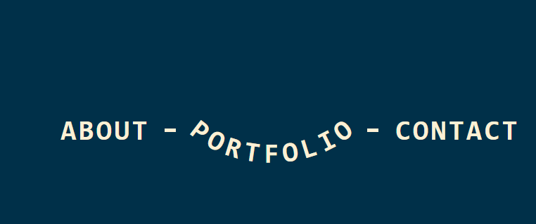
un texte qui se plie
<!doctype html>
<html>
<head>
<meta charset="utf-8">
<title>Document sans nom</title>
<style type="text/css">
	@property --_s {
  syntax: "<number>";
  initial-value: 0;
  inherits: true;
}
ul li a {
  --h: .12em; /* control the elastic effect */

  display: flex;
  gap: .15ch;
  font: bold 40px monospace;
  transition: --_s 1.5s var(--easing);
}
ul li:hover a,
ul li:has(a:hover) a {
  --_s: -1;
  transition: --_s .3s;
}
ul li:has(a:hover) a {
  --_s: 1;
}
ul li a span {
  offset: shape(from .5ch, curve to calc(100% - .5ch) 50%
            with 30% calc(50% - var(--_s)*sibling-count()*var(--h))/
                 70% calc(50% - var(--_s)*sibling-count()*var(--h))
    ) calc(99.9%*(sibling-index() - 1)/(sibling-count() - 1));
  pointer-events: none;
}
ul li {
  position: relative;
}
ul li:after {
  content: "";
  position: absolute;
  inset: 0 0 50%;
  cursor: pointer;
}
ul li:has(a:hover):after {
  inset: 0 0 100%;
}
ul li:hover:after {
  inset: 0;
}

body {
  margin: 0;
  height: 100vh;
  display: grid;
  place-content: center;
  background: #003049;
  /* from https://linear-easing-generator.netlify.app/ */
  --easing: linear(
    0, 1.42406 3.67%, 1.65745 4.64%, 1.71709 5.111%, 1.74059 5.591%,
    1.73313 5.971%, 1.70302 6.361%, 1.57154 7.201%, 0.68765 10.781%,
    0.57364 11.621%, 0.53175 12.451%, 0.53598 12.831%, 0.55521 13.231%,
    0.63817 14.071%, 1.19719 17.652%, 1.26945 18.492%, 1.2961 19.322%,
    1.2935 19.702%, 1.28141 20.102%, 1.22906 20.942%, 0.87551 24.522%,
    0.82972 25.363%, 0.81279 26.183%, 0.81425 26.563%, 0.8217 26.963%,
    0.85499 27.813%, 1.07903 31.403%, 1.10761 32.233%, 1.11838 33.053%,
    1.1128 33.833%, 1.0918 34.683%, 0.9501 38.274%, 0.93199 39.104%,
    0.92516 39.914%, 0.92863 40.704%, 0.94188 41.554%, 1.0315 45.145%,
    1.04288 45.965%, 1.04731 46.775%, 1.04586 47.455%, 1.03969 48.185%,
    0.98337 51.745%, 0.97376 52.705%, 0.97009 53.635%, 0.97488 55.056%,
    1.01049 58.616%, 1.0189 60.486%, 1.0159 61.926%, 0.99343 65.477%,
    0.98806 67.337%, 0.98996 68.807%, 1.00408 72.327%, 1.00753 74.157%,
    0.99524 81.008%, 1.00297 87.699%, 0.99812 94.579%, 1.00074
  );
}
ul {
  display: flex;
  flex-wrap: wrap;
  gap: 0 4em;
  list-style: none;
  color: #fdf0d5;
  padding: 0;
  margin: 0;
}
ul li:not(:last-child) {
  border-image: conic-gradient(currentColor 0 0) 0 1 0 0/calc(50% - 2px) 1em/2.5em;
}
ul li a {
  text-decoration: none;
  text-transform: uppercase;
  color: inherit;
  padding-block: .2em;
}
</style>
</head>

<body>
	<ul>
  <li>
    <a href="#"><span>A</span><span>b</span><span>o</span><span>u</span><span>t</span></a>
  </li>
  <li>
    <a href="#"><span>P</span><span>o</span><span>r</span><span>t</span><span>f</span><span>o</span><span>l</span><span>i</span><span>o</span></a>
  </li>
  <li>
    <a href="#"><span>C</span><span>o</span><span>n</span><span>t</span><span>a</span><span>c</span><span>t</span></a>
  </li>
</ul>
</body>
</html>